Oak & Luna
Brand Development and Marketing Design for a beautifully crafted personalised jewelry brand.
-
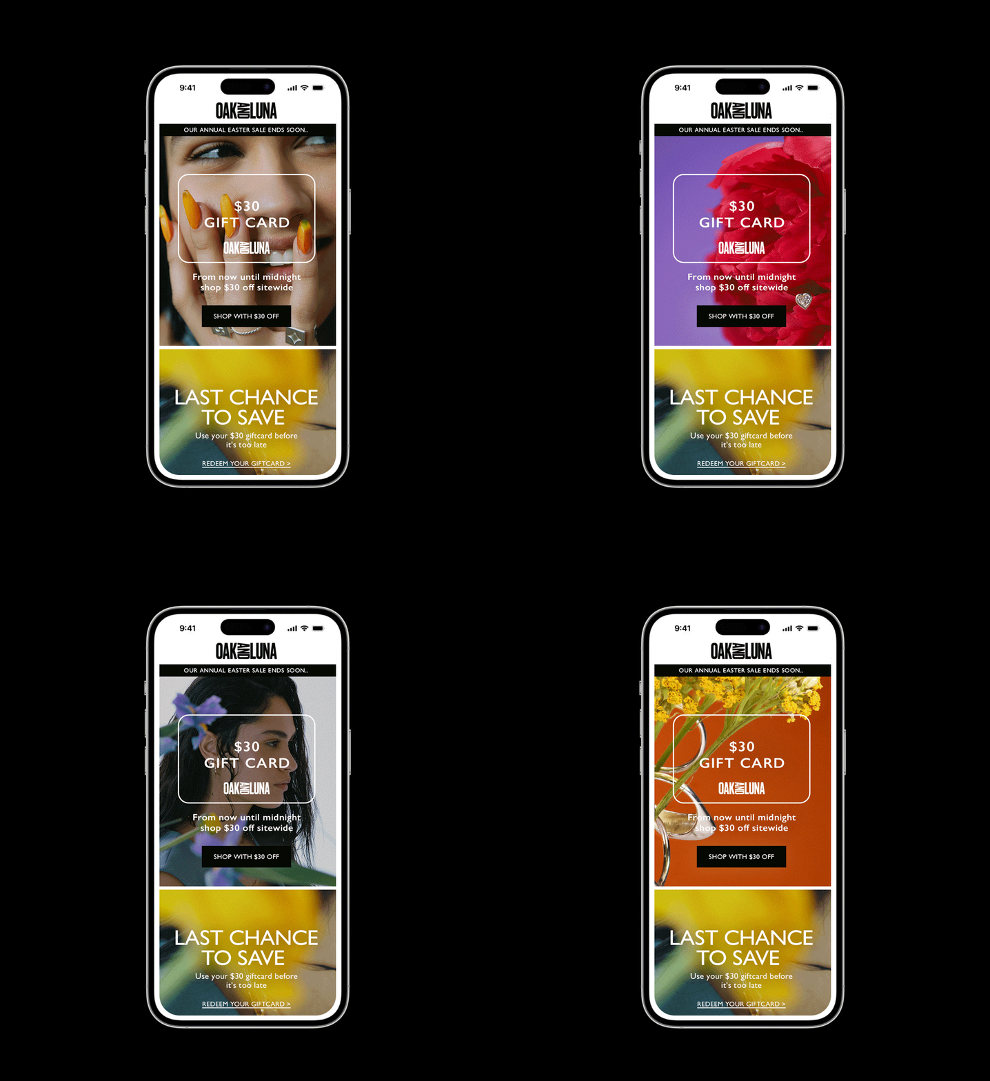
Oak & Luna, a beautifully crafted personalised jewelry brand were after a brand refresh. Through an unpretentious and fun identity, starting with the logo that is playful with quirky letterforms. The logo is complimented by the set of bold and distinctive graphic illustrations that feel distinctive and eye-catching, whilst simultaneously allowing the designs to draw inspiration from their eco responsibilities.
The rest of the brand world feels both stylish yet warm and friendly through colour, graphic expression and an approach to art direction which uses natural light and promotes self-expression.
The brand was seamlessly extended into all social, marketing and print identity.


