Cuvée Beauty Website Iconography


Product Icons
Keeping with the champagne-feel, we used a lighter gradient, typography with movement and stagnation and also bubbles and champagne iconography to give the call-outs both a higher impact to the viewer and also the feeling of them being alive and sparkling.


Footer Icons


Social Icons
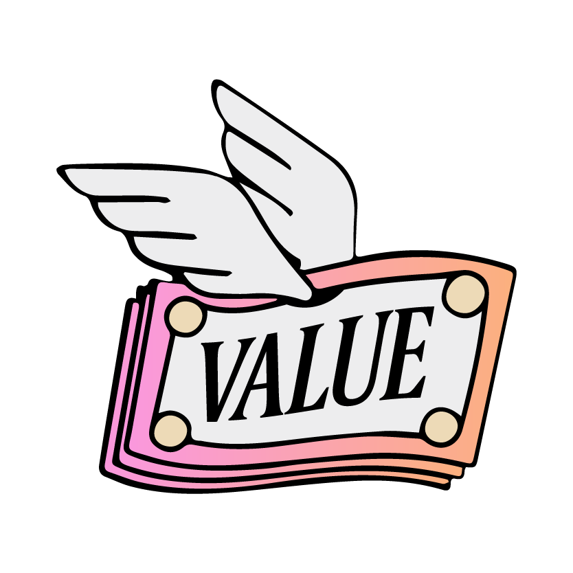
The brief was to create something a little more witty and playful for the champagne-infused beauty brand. Using their existing champagne color tones, we created a lighter more millennial gradient to be used as the common thread throughout both the social and product icons and played with a more hand-drawn/illustrative feel to project something a little more quirky.